In the past few years, we have seen many trends in book cover designs come and go. However, there are some new changes on their way that will be dominating publishing markets by 2022!
In 2020 it was all about matte covers with no shine or gloss to them as they felt more contemporary but now this year’s trend seems like a predecessor of sorts because instead of having vibrant colors inside your pages you’ll see duller shades which give off less attention-grabbing feel due tp overuse perhaps? Who knows what tomorrow might bring so stay tuned.
Typography
Typography is an important aspect of graphic design and will continue to be in the future. The use or lack thereof can make or break a book cover, which means it’s crucial for indie authors who are looking at creating their own unique identity with what they produce as well as how people receive said product from them through media channels such as social networks like Facebook etc.
Bold typography is going to be used to catch the readers’ eye. This will create visibility and draw potential customers into reading more about what they’re looking at, which ultimately could increase revenue for your company!
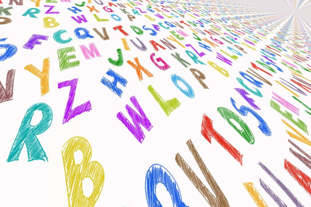
The way that books look can really capture your attention – so most of the time they have the use of typography in order to make sure you’re drawn into their world right away!
Minimalistic Cover Designs

Minimalistic designs are popular among graphic designers because they want to create a simple design that everyone will understand. For example, you might see the name of your book and an illustration or drawing depicting what’s inside in small letters on one side only – no clutter!
Minimalistic covers are all the rage right now, with one central element being prominent. This is in contrast to the book cover whose entire surface was laden with patterns once upon a time ago when design styles were more complicated than they seem nowadays due to the simplicity that allows you to focus on just 1 central element instead of everything around it.
Minimalistic book covers are often designed to be minimalist in nature, which means they have a lot of white space on the cover. This is done with an intention that draws attention toward one specific element within these designs—usually what provides context or details about its content.
Hand-Drawn Letters

Illustrations have been the go-to design for book covers over recent years, especially those that tell a children’s story or contain mystery. These are often illustrated with handwritten letters on them as well!
Hand-drawn illustrations, calligraphic typefaces, and rough sketches are all trends that we can expect to see more of in 2022. This is because illustration has become so widespread – it’s almost like an obligation! So if you want your book cover design to stand out from the rest then give them some personality by including these elements into their creative process for this next year.
Retro Elements May Come Back

Book cover designers are going back in time to 70s and 80s style. The public is remembering TV shows from that era, so it’s only natural for book covers designed then be projected onto them as well.
The designs in 2022 will be reminiscent of the 1970s and 1980s. We can expect fonts from that era as well as colorful graphics to give off an old-fashioned vibe with modern twists that we haven’t been seen before now!
Collage
The use of collages in book covers is a popular trend that we can expect to see more often in 2022. This creative design technique allows for expression and summarization at once, creating an innovative look with unique content!
Collage is an interesting trend that encourages designers to explore creative possibilities. The more combinations of shapes and textures you can get on your design, the better!
All Images provider by https://pixabay.com/
7 Tips for Freelance Writers – Serious Writer


0 Comments